PORTFOLIO
Property Inspection App
Design Challenge
To design an app that is simple to use and provides an easy way for home buyers to quickly capture what they need to help their decision making process while inspecting properties.
Role
Lead Designer
Focus
User Testing with a prototype
Client
My UX Design Approach

-
Competitive Analysis
-
Desktop Research
-
User Interviews

-
Personas
-
Design Collaboration

-
Wireframes
-
User Testing
-
Design Iterations
Challenges for Home Buyers
- Home buyers are busy and overwhelmed with all the activities involved in looking for a property. Using another tool during a property inspection needs to be seamless and not interfere with the actual experience of absorbing the physical space. The interactions need to compliment the experience.
- Home buyers often make impulse decisions based on emotion. Giving them a tool to compare properties more objectively can help buyers to make better decisions.
What we did
We had spent two weeks creating design flows based on existing data analytics and previous user interviews. Personas were created, and I facilitated a design collaboration workshop to incorporate design thinking into our process. The objective was to innovate our design direction and use this to gather additional insights for a round of user testing.

User Interviews & User Personas
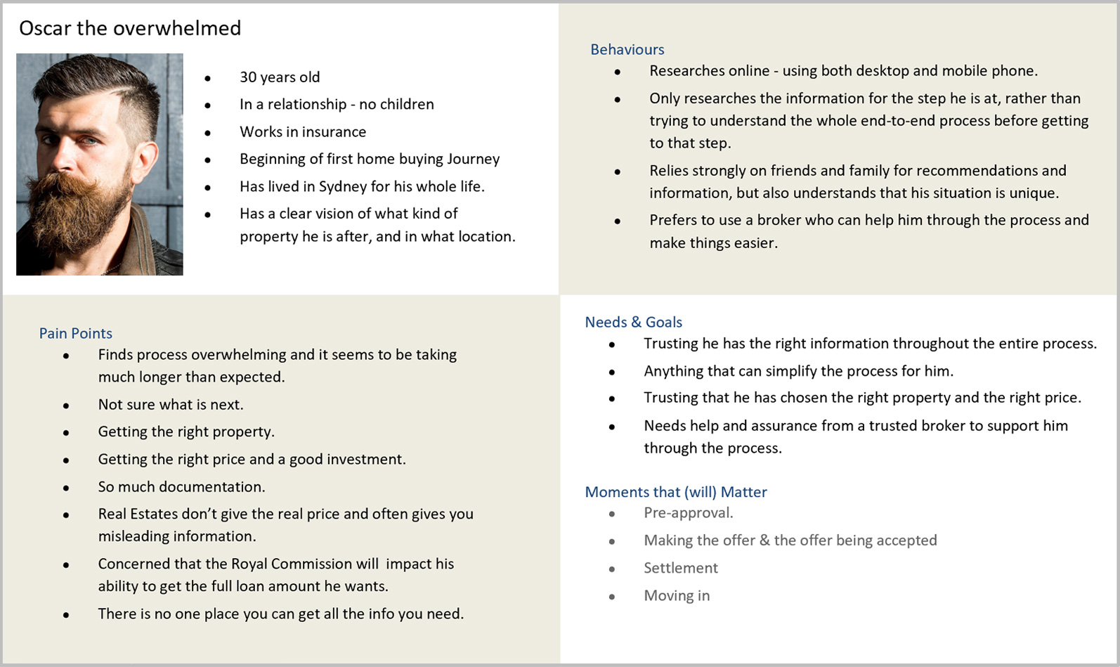
Below is one of the personas created from the user interview data that I had previously collected.
We had interviewed ten new home buyers in face-to-face one hour sessions,
to really understand the challenges they faced while going through the home buying journey.
Design Collaboration Workshops
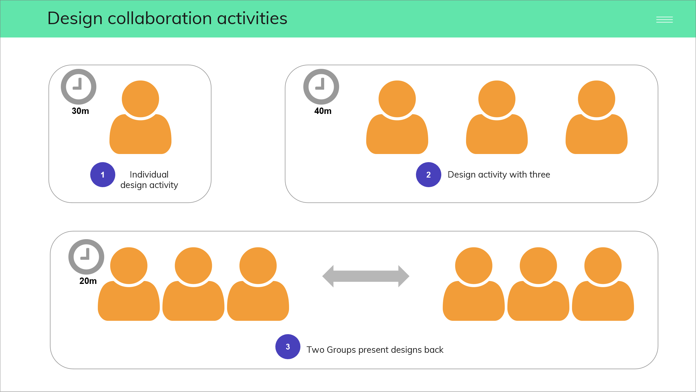
- An initial design collaboration workshop was run with team members to capture a range of ideas and approaches for the interface design.
- These ideas were incorporated into the first design iterations.
- Multiple design collaboration workshops were run during the design process.
User Testing – what they said and we observed…
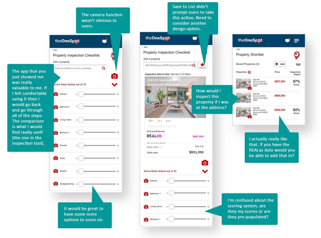
We carried out 10 one-on-one user testing sessions with participants who are were in the early stages of buying a home, using an online mobile prototype. I had created these mobile wireframes based on our previous design collaboration workshops.
The screens here capture some of the user feedback from the user testing sessions.
Outcomes:
The next design iterations
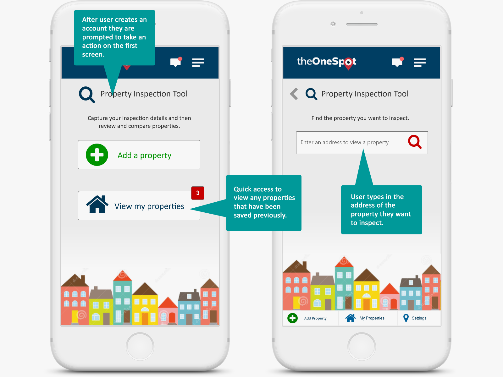
Based on the insights of the user testing sessions, we created the next iterations of the design flow.
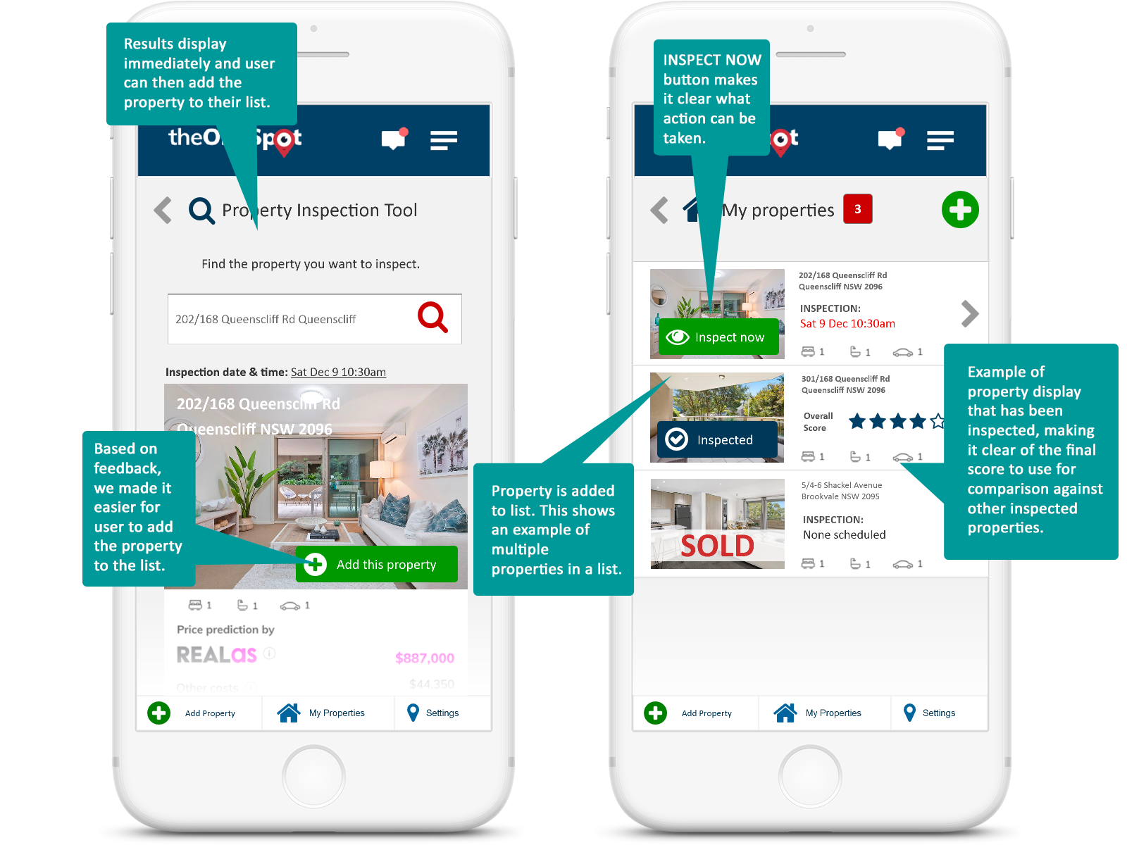
The mobile screens here identify many of the design elements we modified, plus additional components we added to assist the user experience.
More iterations…
I used lots of visual indicators to help the user quickly identify key actions, such as adding a property to their list, and inspecting the selecting property on arrival at the location.
Added features
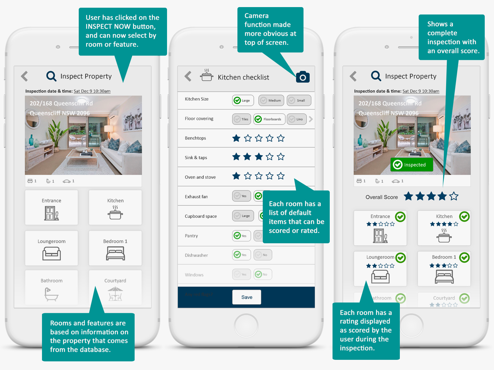
These screen demonstrate how a user documents the features of a property by selecting a room type, and then being able to tap on options and quickly rate elements in that room. To speed up the process, each room would have a default list of items common to that room type. For example, a kitchen would have benchtops, a sink, oven and stove, and cupboard space.
The app also automatically calculates an overall score of the property based on the score of all the individual elements.
Next Steps
Our next step was to identify our minimum viable product and to start development.
We were so lucky to have the opportunity to test our assumptions with continuous user testing sessions. It’s incredible how much user testing with real users contributes to successful outcomes.


