
PORTFOLIO
Student Management Console
Design Challenge
This project was initiated to address the issue of school teachers still using an old Flash version of the Mathletics product, when there is a newer, but badly designed HTML version available. This was losing customers for 3P.
Role
Lead Designer
Focus
End-to-end design process
Client
My UX Design Approach

-
Review quantitative and qualitative data
-
User interviews

-
List of existing product features

-
Online prototype
-
User testing
-
Design Iterations
-
Post launch testing
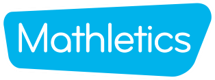
Legacy interfaces – Flash & HTML
The “new” HTML designed console was harder to use than the old Flash version. Without an efficient alternative, 3P was in danger of losing schools as long term customers.
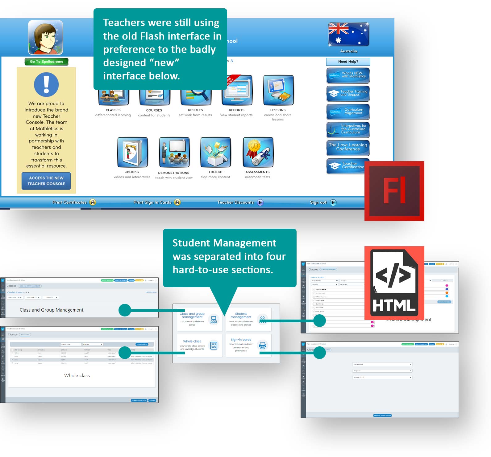
Reviewing quantitative and qualitative data to understand key issues…
- We already had lots of quantitative and qualitative feedback from teachers identifying the many issues faced.
- To validate our assumptions, we started the research phase by interviewing around 10 teachers over the phone to identify and validate the key reasons they were struggling with the “new” interface.
-
Based on the teacher interviews feedback, we felt confident to move into the design phase, also knowing that there were technical limitations and time constraints. We still needed to deliver a strong design solution for teachers to solve their key issues.
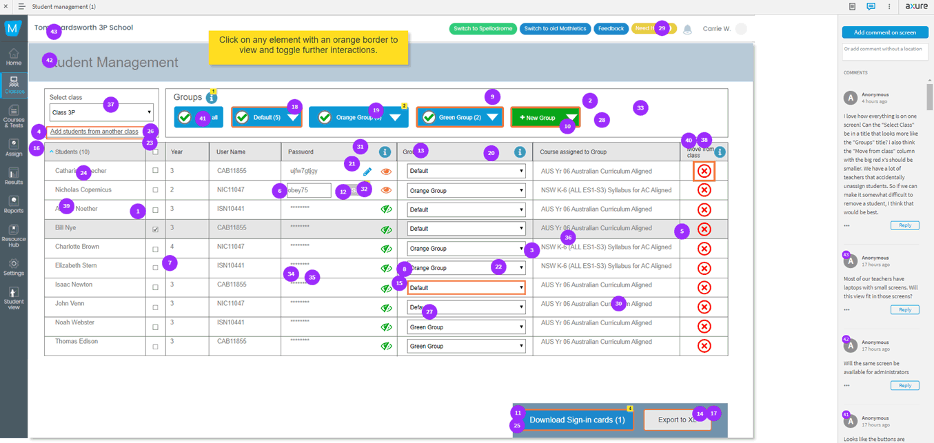
Online user testing – collaboration with the entire company!
Next I created an interactive design prototype, combining all the 4 separate function areas into the one screen.
We had no budget or additional time for user testing with teachers.
We sent out a company wide email with a link to the online prototype to gather feedback from all of 3P Learning, asking them to complete some tasks. The purple dots indicate the feedback. There was a lot.
This was a much quicker way to gain user feedback from subject matter experts from within the organisation than recruiting external users.
Design iterations
Based on the user feedback, the designs were iterated to capture the useful suggestions and recommendations that were provided during the prototype testing.
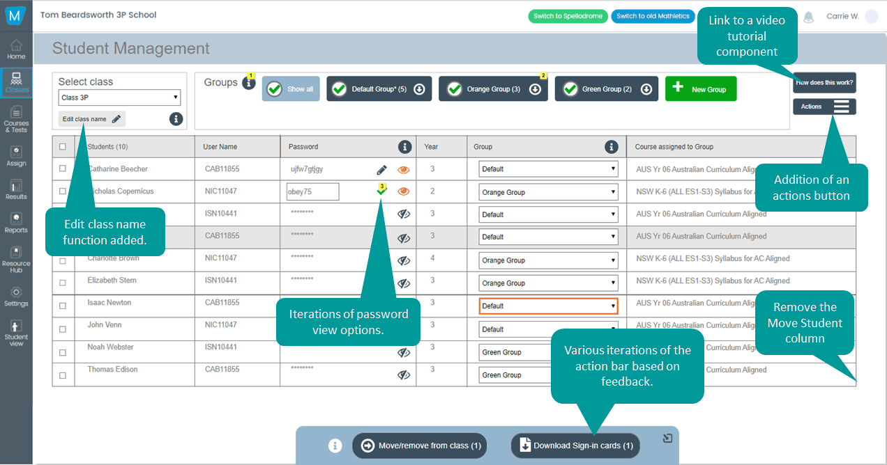
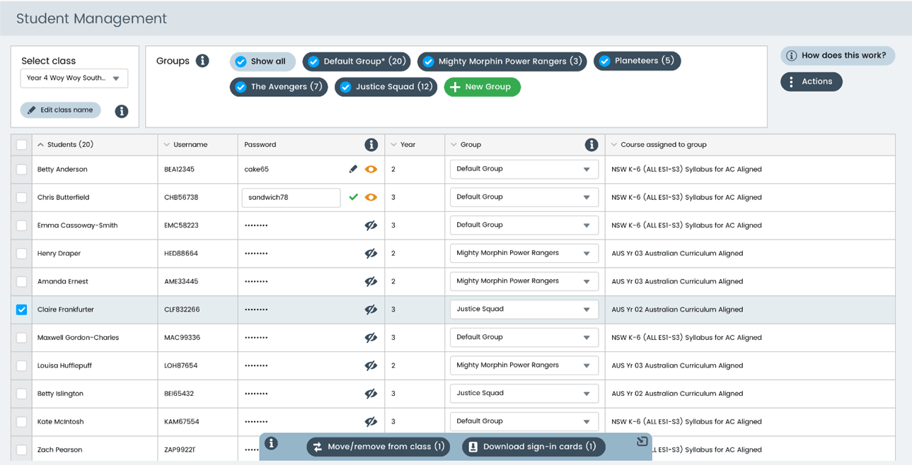
Design outcomes
Detailed designs were created, and the UI design for the interface was completed, as shown here.
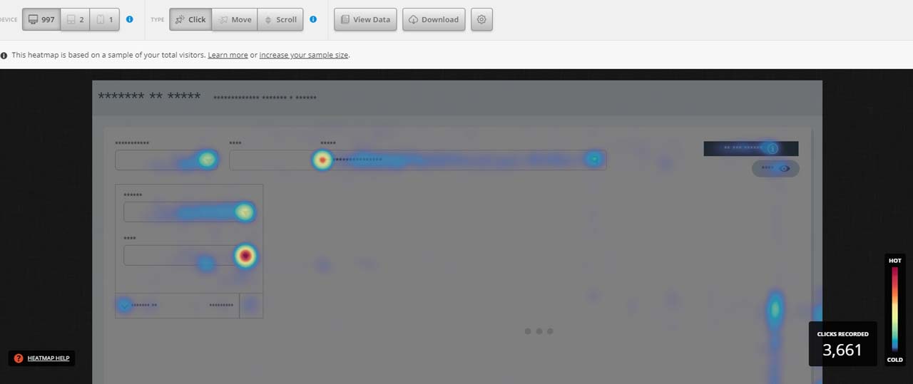
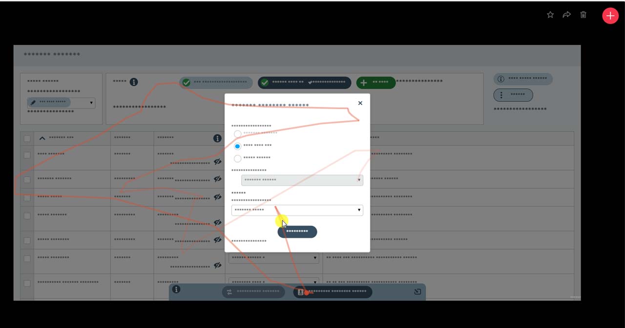
Measuring Outcomes – heatmaps & user videos
After the new service went live, we implemented a tool called Hot Jar to create heat maps that allowed us to track how the users were interacting with the new interface. Hotjar also allowed us to capture video sessions of users.
We held weekly meetings to identify patterns of user behaviour. This allowed us to continually improve the experience by making design tweaks, and continue to measure these outcomes.
Learnings & Outcomes – identifying lean opportunities
- Although we didn’t have the opportunity to test with end-users (teachers), making an online prototype available to the wider staff of 3P captured incredible amounts of information that definitely improved my design. It also helped to educate and involve everyone in the UX process.
- Also, using a third part tool, like Hotjar, was a great substitute for user testing after launch, again providing useful insights to validate some design components, and improve on others.
- Outcomes – The end results saw teachers using the new version and preferring it over the older Flash version and the HTML version that was replaced.